When we where doing Gameification we had to try working on the potters wheel, and when I got on the wheel it started out really hard, but I caught on very easily! It's not as hard as you think. You just have to lock you arms and go with your instincts because you just work with the clay until you like it! When I started I found I was easier if you had water on the wheel because then there wasn't as much friction on your hands as not so much water! I thought it was easy but if you read some of my friends blogs they say it's really hard. It just depends on who are I guess!
|
Again this picture came from my aunts kitchen! We both love to cook and bake so this was one of my favorite paintings to do! I had lots of fun deciding what to do! I choose to do no background! Then I started on my letters then made my rolling pin! After that I called it good because it looked really nice. It was almost just like my aunts canvas painting! I thought this was one of the top three paintings I did because it came out very clean, and crisp.
This painting was made from a memory of my aunts kitchen! She has a million different cool quotes around her house! One of them that I remember is BE GRATEFUL! With a picture of a cheese grater! I really loved this, so I decided to make a painting of it. I think it turned out better than some of my first paintings! I started with writing the letters of the quote! Then I painted the outline of the cheese grater! Soon I was filling in the the grater and started putting black dots on my grater. When I was done I thought it would have been nice if I did less dots and spread them out more, but this was just what I thought! I was also wondering if anyone had thoughts on how to make the dots the same size every time? Leave me some feed back in the comments, I will try to do everyone's ideas to see witch one works!
This is one of my favorite paintings that I did because it looks really neat! I got the idea from the background I made. I started by doodling my background. I thought it looked like the sky, and I thought of the sun. Then some how I thought of the song my mom sings to my youngest brother. I saw the painting lay out in my head. I would make the sun then add the lyrics over top! I mixed yellow, a little orange, and some white to make the sun. It took two layers to cover the lines in back. It still isn't fully covered, but I like it showing some of the lines. Then after it dried, I wrote "you are my sunshine" then soon after I found myself writing the next line "my only sunshine!" I liked it like it was! Soon I was holding up the painting admiring it and giving myself feed back! I think the painting turned out really nicely for being made up out of the dust!
I really like this painting because I love to make people smile! One of my favorite Quotes is "smile big because you can not because you want to!" Every morning no matter if it's a Monday or a bad day I get up and try to keep a smile on my face all day! I really don't like walking into a room with a grump. This is because their negativity will rub off on others! I really like the smiley faces on both sides because it draws attention to the painting! It also brightens the painting up! It makes people smile too
When I made this painting I didn't know exactly what I was going to do because I was running out of ideas. I started with a purple background! I love the color purple, so that is how I picked the background color. Then I wanted to do something simple. While I was letting the painting dry some I started to think of what I was going to put on top of the purple. I like the color purple, and orange together. The I thought about doing a heart over top to represent someone doing something kind. This was because I like to help people, and when you help someone you feel really good about what you did. Some people tend to say it makes your heart glow. That is where the heart comes from. It was pretty much just a simple idea that came into my head with multiple meanings! When I made this painting again I discovered that it is hard to cover up a dark color! I want make sure that people understand IT IS REALLY HARD TO COVER DARK COLORS! I made this mistake so many times!
When I did this painting I found it useful to use a bigger brush. I was doing a background for this painting, so the bigger brush helped a lot! I also found that it was easier to do a lighter color under a darker color! It takes many layers to have a lighter color to show up on a dark color! When I started my painting I didn't really know what I was doing! I started by painting a random background, then I thought it would be neat to have a quote over top. I also thought that it would be neat to have the quote in yellow because yellow goes nicely with purple, and black! I soon figured out what I was doing! I have liked the quote "just be you," so it was what I was going to use! When I finished the background I came back to the painting the next day. I had to wait for the painting to dry, so I could write the quote! I learned that it takes many layers to have yellow show up on black, and purple. It took 3 layers of yellow to look the way I wanted it to! When I was done I looked at my work, and I thought of all the reasons why I really like the quote that I picked! I really like it because I nver wanted to be the same! I have always thought it would be so boring to have someone just like me! I think my main point was to show people to be themselfs, and be happy with yourself!
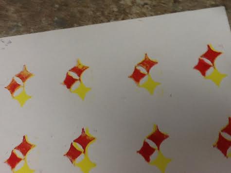
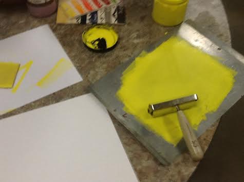
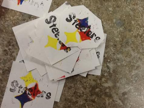
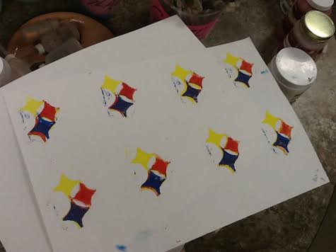
In my last post I talked about my Collaborative Prints with Jess! We actually used the linoleum blocks that we had to make our single prints! All we had to do was print! Now you might be thinking oh that's easy. That's what we thought, but we were wrong! We had to make my prints with 3 colors, and line them up nicely. Then we had to wait for all the layers to dry! After that we had to put Jess's print on top! It took us a little while to learn how to do it just right, but we got it. We had to get all of the inks out. We used the colors blue, red, yellow, and black. Then we had to get paper, and the briers out for the ink. Soon after we where following the steps of the single prints. When Jessica and I where making this project we talked about a few things we thought about the prints. We both really liked printing the letters because it was really easy, and if you slid the print forward it would make cool fonts. We also thought that we where improving on problem soling because we ran into so many problems that we just had to think out of the box a little. We thought that we should have used a paint brush to touch up on some of the diamonds because they smeared really bad. We had thought about adding a background, but we thought that might have taken away from the print itself! If you look below you can see some of our pictures we took along the way! |
AuthorMy name is Alex! I love going to karate classes and, reading!!! Archives
May 2015
Categories |
 RSS Feed
